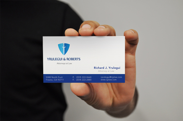
Business card #3
This is the third blog post referring to business cards. In this blog I've decided to showcase a one sided business card. In this business card it is very clean and organized. The weight is evenly distributed. I also am a big fan of the border at the bottom that is engulfing the contact information. While I like this card I also have a few pet peeves to discuss. I feel the text should be larger in the persons name and title, even in the logo. The border at the bottom could also be a slight bit large to counter the white space and make it seem less empty overall.

No comments:
Post a Comment