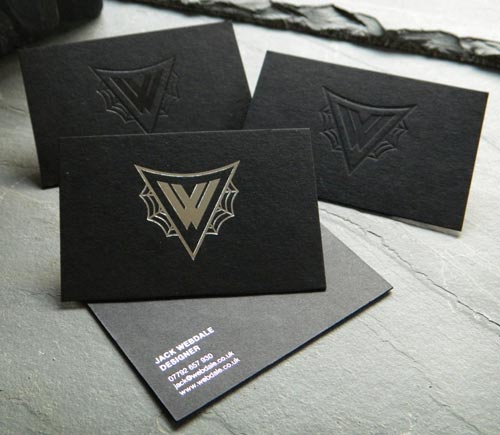
Wednesday, May 7, 2014

Blog Post #50!

Business card #14

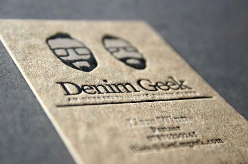
I chose to use this business card as an example of how some people are now creating business cards that double as another object usable in daily life. This specific card has chosen to double as a small booklet in order to write tiny notes in. It surely will stand out among other cards simply because of how unique it is. Just remember that when doing something like this, keep it simple. The more complicated a design is the more likely a person is to overlook your card and throw it in the trash.
Blog #49

Business Card #13

This was another business card that stuck out among the other two sided designs. I specifically chose this card to show how to properly utilize multiple colors that flow together into a very successful combination. This card also seems to be printed on thicker than average paper or card stock which will prevent the card from getting squashed or ripped in a persons wallet. I also enjoyed how streamline this card was when providing its information and carrying on its individual brand throughout the card.
Blog Post #48

Business Card #12

I chose to use this business card as an example for when to incorporate aspects of your business into the ca rd. This card has chosen to look like a color swatch that a professional painter may show clients in order to help them decide on a color. This card also has a very simple and professional look that pairs well with the multitude of color options. The only quarrel I have with this card is that it can be overly expensive to print cards in multiple colors rather than having one defined design. 
Blog Post #47

Business card #12

This business card displayed a very cool idea for business cards. If you want a potential client to remember you what do you do? How about slap a picture of yourself on the business card. This card will definitely stand out among others. Included on this card is a simple design utilizing the textual parts of this card in a clear and organized fashion that isn't distraction or complex
Blog Post #46

Business Card #11

This is another one sided business card which I loved. This card is complicated but still readable and interesting at the same time. The text and lines seem to be sunken into the card in order to add depth and texture in order to stand out. I also like how this was a two-tone card that had an old timey style. Very great card that I will definitely use some of the aspects when making my own.
Blog post#45

Business card #10

This is another example of a one sided business card design. I found this card extremely unique when I looked at it. I think business cards should represent your personal style, especially when you are in any sort of art field. This card is one of the more artistically designed cards Ive seen that is extremely successful in my eyes. The card is laid out on a white background but has color intertwined to make everything else pop out.
Blog Post#44

Business Card #10

This is another example of a one-sided business card that has gone against the norms and turned the card on its bottom. Even though this is a very simplistic card it displays a very solid understanding of design that I find very appealing. I also like how the back of the card pops with the yellow landscape in order to separate itself completely from the front of the card.
Blog post #43

Business card #9

This will be the second example of a one-sided business card that I will be discussing. This business card is OK, it meets the proper standards. The contact information and personal name and position are located properly but I feel the logo and the corner design is lacking in style. Like my professor states on multiple occasions "Don't be afraid of white" In this case it looked as if the designer liked white a little bit too much. I feel the space in where there is only white is underutilized
Blog #42

Business card #8


I will be doing a small set of examples referring to one and two sided business cards specifically. This is the first one sided business card. One sided cards generally tend to look more professional and are produced on a massive scale for individuals because these are the type of card which you should plan on handing out a lot of. I like this card specifically because it is very professional and clearly lines out the contact information and name of the card holder. Unfortunately I feel that the base of the card needs a little bit of color separation, possibly a light green or white border running along the bottom to tie in with the logo.

Tuesday, May 6, 2014

Blog Post#41

Business Card#7

I chose to show this business card because it has engraved characters instead of regular print. I thought this had a cool effect that made it unique among other cards. The colors of the engraved logo and the card seem to clash very well. The only thing I find lacking is how little contact and personal information is shown on this card. I just feel like some of it is a bit lacking in a design aspect.
Blog post#40

Business card post #6

In this blog post I will be covering business cards that are using textures and different material. With this business card it would seem that they have decided to make their business card out of a different material all together in order to separate themselves from their competition. There are many pros of doing this kind of thing, although it can be very very pricey when compared to o the normal cost of business cards. So when thinking about buying business cards just remember you're going to be handing out a lot of these, dont go breaking the bank trying to get your name out there.
Blog Post #39

Business Card #6
This is another example of die cutting, done right this time. There are many things I like about this card. I like how simple yet informative it its. The color contrast is also very interesting as is still carries the brand throughout the card. Now to talk about the die cutting. As opposed to many other die cut card this card took a modest approach by making the card have a slight curve and cutting out the shape of the logo. I feel this card has done a very good job at serving its purpose.
Blog Post #38

Business Card #5

In this blog I will cover some things about die cut business cards. Individuals who are seeking to make themselves stand out among other businessmen have started to create die cut business card to make theirs seem unique. When done correctly they will do just that, when done incorrectly they will look, for lack of a better word, really stupid. This business card shows the downfall die cutting. For one, a business card is meant to stick in someones wallet or pocket comfortably, if the card is made into a wonky shape it wont fit anywhere except the trashcan when the individual who has received your card throws it out. With this card specifically the text is almost unreadable because it has been set on a circular path, a business card shouldn't take anymore than ten seconds to read, with this it would take a minute with a magnifying glass to see what the name of the company is. Be sure to stay away from these die cutting taboos when making your business cards. 
Blog Post #37

Business card #4

In this blog entry Im going to cover what your shouldn't do when designing a business card. The above card is a perfect example of a bad business card. First of all, white space is good, when used in moderation of course. Too much white space makes the card seem way too bland and lifeless.  Another problem I can see is that the font changes multiple times throughout this card which is no good when trying to keep a general theme. Im not saying you should stay away from font changes completely, but limit it to only two fonts if doing so. The weight of all of the text is also forming toward the middle,which is forcing my eye to only go there. In conclusion there is no continuation of this companies brand image. 
Blog Post#36

Business card #3

This is the third blog post referring to business cards. In this blog I've decided to showcase a one sided business card. In this business card it is very clean and organized. The weight is evenly distributed. I also am a big fan of the border at the bottom that is engulfing the contact information. While I like this card I also have a few pet peeves to discuss. I feel the text should be larger in the persons name and title, even in the logo. The border at the bottom could also be a slight bit large to counter the white space and make it seem less empty overall.

Blog Post#35

Business Card post #2


This was one of my favorite business cards that I saw while browsing through them on the internet. This card does a very good job at being professional and informational at the same time. The personal information of the worker is clearly printed and isnt being bothered by sizing or spacing issues. I also love how the color scheme is switch from front to back, even though it is different the brand image is still carried throughout the card. As well as the logo being on the front and back in order to burn the image into the brain of whoever is reading this card. This is a very good example of an effective and professional business card.
Blog Post#34

Business Card Blog Entry #1

In this set of blog entries I will cover professional business cards. In some of these entries I will also be analyzing the ins and outs of the business card to exploit there shortcoming or design mistakes. 


I have chosen the above business card as my first post simply because it stood out among my search of professional business cards. This cad grabbed my eye for many reasons, one being the color changes, the other being the logo. I think the switch in color to add contrast was a very nice touch, as was continuing the logo onto the back to further push their brand. I have a problem with the front of the business card, even though the logo is there I feel like it is missing something to push it to its final step, perhaps a website or the name of the law firm.
Blog post #33

Business flyer #5

This is the fifth installment in my blog entries referring to business flyers. Since I discovered other die cut products in my previous blog entries found it fitting to return to that aspect in this blog post. Going back to the alternative of using a brochure or small pamphlet instead of a flyer on a regular piece of paper I have chosen this specific product as an example. I really loved this product. The type is organized throughout the the design so that the weight is evenly distributed among the pages. I thought the color pallet was very interesting because it not only gave this pamphlet some enthusiasm, it separated the provided information effortlessly seamless ly. There is also personal business information located on this which is very important.
Blog Post #32

Business Flyer blog #4

This is the fourth installment in my blog entries referring to business flyers that are to be placed inside a professional business folder. In this blog post I've decided to cover a business booklet that could also be included in the final folder. Many companies and business are branching out and throwing out new types of informational sources in order to edge out their competition. A booklet including a hefty and detailed amount of information could be the weapon that will make you able to achieve victory in the war against other competitive businesses. I say this because its more personal and descriptive than any other source could be. A simple flyer could only hold so much information before becoming jumbled and illegible, a booklet does not have such problems. I chose to showcase this specific example because it shows how you can show facts and information while still having a good design and color theme to go throughout the entire project.
Blog Post#31

Business Flyer #3

This is the third post in my blog referring to business folder flyers for my graphic design project. This inst necessarily a flyer, but more of a pamphlet or brochure that could be placed inside the business folder. A brochure could serve the purpose of looking more professional and perhaps being able to hold more essential information than a simply flyer. I like the Idea of a flyer because it is more interactive when looking through it and it can show more of what your business has to offer. I like this specific example because it is very professional looking and clear.
Blog Post #30

Business Flyer Blog #2

This is the second blog entry for my graphic design project relating to business flyers that are to be placed inside business folders. This business flyer effectively outlines the required information that a business should inform their customers of. It also has a very nice and organized look that does not confuse of distract from the information present in the flyer. I think this ad could have benefited from finding a better way of presenting the information rather than just listing it along the side of the page.

Pros:
-organized and clean
-Nice cooling color pallet
-All business information is included, even contact and website info

Cons:
-Text is a lacking
Blog Post: # 29

Business Flyer Blog #1

This is the first of the set of Business flyers that I am researching which will be included in my business folder final project. Even though this example of a business flyer is a stock photo of a flyer, it still displays a solid design aspect that appeals to me. I enjoy the two tone color palette that lends itself to simplicity. Like I said before I like enjoy simplistic designs that aren't too over complicated but still provide a large amount of information. This flyer does a good job at having space and opportunity to to provide valuable business information which is essential on these forms of advertisements.
Blog Post #28

Business Flyer Blog #1

This is the first of the set of Business flyers that I am researching which will be included in my business folder final project. With business flyers they are meant to outline what the business/company is about and mainly supposed to provide information to the customer. I find these business flyers to be somewhat effective. The color schemes are very simple throughout this set of ads and arent too overly complicated.

Pros:
-Streamline Design
-Cool color themes
-A sufficient amount of information provided

Cons:
- Some parts of this flyer are a bit busy

Blog Post #27


Business Folder Blog Example #14


This is the fourteenth post in my blog entry for my graphic design project. I chose to use these folders because I think it's really cool that the same image was used continuously through the entire folder design. These folders were also die cut and very unique shapes.
Blog Post #26 


Business Folder Example Blog #13

This is the thirteenth business folder for my graphic design blog project. I chose this folder mainly for its overall simplicity and great design aspect. The design of this folder flows very well throughout the entire thing. This folder also provides contact and business information which is important in any business ad or folder. The one problem with this folder is that I feel like the text is way too small to be effective in any way.
Blog Post #25

Business Folder Example Blog #12

This is the twelfth entry for the business folder regarding my graphic design project. I chose this folder because it utilized the multi-fold method like the other folder presented in my blog. However this time the folder is presented in landscape to provide more information. I thought it was also very cool how they kept the same general theme throughout the foldany real distractions when viewing these foler. It wasnt too overly complex either so there weren't any distracting materials when reading this folder. The only thing I would have included was contact information somewhere on the folder.

Blog Post #24

Business Folder Example Blog #11

This is the eleventh business folder example for my graphic design blog project. I wanted to present this folder because I found it displayed a strong sense of design integrity. I also liked how it was once again die cut so it could be different and hold another shape than other folders. This folder also had a a good logo, along with proper placement of its elements. The only gripe I have with this folder is the lack of contact information present on this folder. Contact information is very important when providing this folder with clients.

Blog Post #23

Business folder Blog Post #10

This will be the tenth blog entry dealing with business folders for  my graphic design blog project. I chose to use another folder that had been die cut because I find them very interesting. I've said it before but I feel like die cutting helps to stand out among the competition. I also like the kind of paper used for this project and how it seems like they have multiple textures displayed across the entire folder. Very cool and interesting design that grabbed my attention right away. The contact confirmation is also effectively displayed across the folder which I feel is very important.

Blog #22


Business Folder Blog Example #9

This is the ninth example of business folders for my graphic design blog posts. I chose this folder because it stood out among the others that I searched. This folder decided to use a tri-fold rather than a simple fold like many other folders. Using this form of folding it made it so the company could provide more information in their folder for their clients or customers. I also loved how complex, yet simple the cover of the folder was. Even though it was only text that was switched around and manipulated, it made for a cool design. Also, never be afraid to use white.
Blog #21

Business Folder Example Blog#8

This is the eighth entry in my graphic design blog that is about professional business folders. I chose to present this business folder design for many reasons. One reason is because it is another example of a die cut folder. Another reason for presenting this is because it had a very different layout than other folders. For instance it includes a CD and instead of being blank on the inside, it has a continued image that spans throughout the entire folder. There is also multiple flaps that are riddled with information for potential customers. All in all I feel this is a very strong example of a business folder.
Blog Post #20


Business Fold Example #7

This is the seventh example of a business folder for my graphic design for my graphic design blog. Even though this folder isnt an actual folder for a company I chose this folder because it was die cut. Many folders these days are die cut to separate themselves from the other competition. This folder does an effective job at being unique and special.
Blog Post #19

Business Folder Example Blog#6

This will be the sixth example of business folders for my my blog entry. I chose to use to use this folder since it bared the greatest resemblance to the folder which we are designing in class. I also enjoyed the overall layout of the information presented on the folder. Another thing I liked about this folder was the border located on the bottom of the folder that is continued throughout the inside of the folder which ties it all together.
Blog Post #18

Business Folder Example Blog #5

This is the fifth folder which I have chosen to use for my blog entries. I understand that this image is very low quality but Im not using it for the design of the front. I wanted to show the different ways that folders could be put together rather than just using a standard layout. For instance, there is only one open flap which is located on the right side of the folder rather than two. Also, the flap is cut an a slant instead of just being its standard line. Lastly I found it really interesting how the business card was integrated into this folder. All in all I was a huge fan of how this folder went against the normal design.
Blog Post #17

Business Folder Example Blog #4

This is the fourth example for my blog entry discussing business folders. with this business folder it is very plain, but its not bad in my eyes because it does an effective job at displaying what the company is all about. From looking at this from a design aspect I can see that there is an issue with the weight of this folder due to the logo being in the corner, and at such a large size. I do like how on the inside the business folder is laid out differently on the inside with the information being up the side, instead of on the bottom flap. I actually like this folder very much .
Blog Post#16

Business Folder Example Blog #3

This is the third post in the set of business folders for my blog entries. I wanted to show this folder as an example of a cluttered business folder. This folder is not all bad, I just felt that the picture placed on this folder are much too distracting and jumbled.
Overall I feel this folder missed the mark for what its purpose was. Although this picture fails to show the the inside flaps of the folder So unfortunately I cannot tell whether or not there is actually any contact information present in the folder.
Blog #15

Business Folder Example Blog#2

This is the second example of of a professional business folder. This folder is advertising for a a high end private jet company and it appears as such. The color scheme and tone of the pictures make it seem all the more professional since. The logo and font are centered as to make it have a more streamline appearance rather than be a business folder.

Pros:
-professional appearance
- Effective color scheme
-Cool logo, and font selection


Blog#14

Business Folder Example Blog#1

I will now be discussing and reviewing business folders for my blog. Business folders serve the purpose to inform potential customers about a specific business. This business folder is very clean and organized. The color spread is also incredibly simple making it less distracting and more formal. The logo placement is effective as well as any clip art placed and contact information.

Pros:
-Clean cut and clear
-Simple Design
-Very professional
-Has contact information

Cons:
-Could have included a logo or some -information in the inside panel
Blog Entry #13

Magazine Advertisements (Favorites #3)

This is another advertisement that I liked more than others. Its probably clear now that I am a huge fan of simplistic ads. Even though this ad is incredibly simple (and foreign) it provides enough information and does an effective job of stating what this advertisement is about.

Pros:
-The color scheme works nicely
-The ad serves a purpose
-The font and text organization is placed very effectively
-Contact information is also provided

Cons:
-Travel information could have been included
Blog Entry #12

Magazine Advertisements (Favorites #2)

This ad is one of my favorites because of how simple and clean it looks.  Travel information is provided as well as the contact information. The colors on this ad also flow very well together. The only problem I have with this ad is the choice of font and location of the logo.


Pros:
-Clean cut look
-Simple color spread and design
-Cool use of design

Cons:
-Logo location is lacking
-Font and text organization could use some work


Blog Entry#11

Magazine Advertisement (favorites #1)
I feel this set of magazine ads that are representing Expedia do a very effective job of selling their brand. I like how simple and clear cut this ad is in addition to providing just enough information to get the reader interesting in this service. While there may be a disclaimer that is full of small and obnoxious text this ad is very effective at outlining exactly what this is about.


Pros:
-Very clean ad
-Highly effective
-Proper use of text and organization
-Correct and proper use of font and logo
placement

Cons:
-Simple information such as website domain or contact numbers failed to make it into the ad


Blog Entry #10

Magazine Advertisements (Dislikes #3)

This ad places in my dislike pile because the layout could be improved as well as the overall image spread. Although this does have the required information necessary for an effective advertisement, it fails to deliver any 'pizaz' and grab my attention. With this ad the designer could have picked more effective pictures to get the point across or provided a more clear cut and organized way to present the travel information. Overall it isn't that great of an advertisement.

Pros:
-Provides listed travel information
-Provides a website and travel information

Cons:
-Incredibly simplistic
-Font and text organization is lacking any type of interest
-Pictures don't flow 

Monday, May 5, 2014

Blog Entry #9

Magazine Advertisements (Dislikes #2
)

This is another addition to my group of advertisements that I feel aren't very well designed at all. This ad has multiple aspects going against it. For one it is way too complicate and is lacking a general theme. The font is awful and doesn't flow well with the rest of the advertisement. The clip art used in this ad doesn't help its case either as nothing really matches.
Overall this is a very unsatisfying ad that looks like its straight out of the 90's

Pros:
-Contact information is provided

Cons:
-Every single thing about this ad. 
-Misuse of font and text organization
-awful clip art